Thread Rating:
  • 0 Vote(s) - 0 Average
  • 1
  • 2
  • 3
  • 4
  • 5
Gimp fonts takes more space on linux than in windows
#1
Using the same font on Linux is a problem since it will look pretty different and then will take different space than before.

On windows it would look like this:
[Image: vQDXXkR.png]

on Linux it looks different:
[Image: s27Yvow.png]

I need a way to make it take the same space as in Windows.
Reply
#2
The problem isn't really the spacing but the weight. One of your fonts is bold.
Reply
#3
Agree with Ofnuts, did some tests Win -> Kubuntu

Not able to comment on the Hebrew font substitution. It looks to me not so much a different font as a different weight. Try selecting all and checking if it is Arial bold or Arial Dark.

For Arial going from Windows to Linux should be OK. It might just be a case of 're-reading' or re-selecting the font.

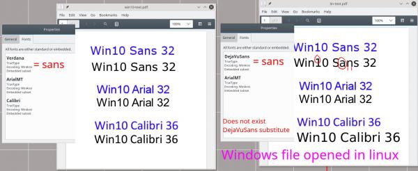
As you reported sans in Windows = Verdana while in Linux = DejaVuSans and there are differences. The only way out is convert the text layer to bitmap in Windows, which might not be possible if you need to edit as text in linux.

If the font does not exist in linux, it will get substituted by DejaVuSans

This comparison Sans - Arial - Calibri with the file created in Win10 and opened in Linux. Blue is text-to-bitmap in Windows.
   

Sorry, not able to be much help. Changing default font might be possible in Linux but Windows, I do not know.
Reply
#4
Thanks for your replays. This is the normal Arial font. I can make it bolder, and it's name is just "Arial" so I guess it's not the bold version. I suspect it has to be something with linux rendering vs Windows's one.

The sans font in linux is DejaVuSans as rich2005 said.
Reply
#5
AFAIK the "Liberation" font in Linux is meant to have the very same "metrics" as Arial. In other words, despite minute differences, replacing one by another shouldn't change anything in the formatting.

Btw, your interest in font metrics make me think that you may be using Gimp for something which it isn't designed for. If you have that much text in your work, you should likely be using a typesetting software such as Scribus (or even LibreOffice).
Reply
#6
Thanks for your comment. I have used that font, it is similar.

I am checking now for a way to change gimp rendering in Linux to be more like in Windows. It seems to be that, but I'm still not sure how to make fonts looks like on Windows - Sharper. Do you know of any way to make linux or gimp on linux render fonts differently?
Reply


Forum Jump: