12-11-2019, 01:49 AM
hi all, im so far only experienced with the basics of gfx editing in general
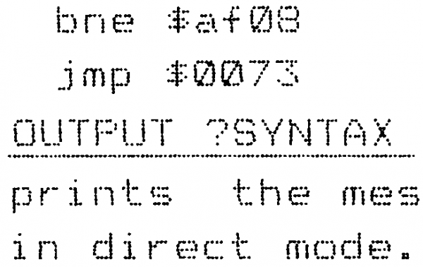
im trying to make the attached example image you see more readable, i was just wondering if anyone has any ideas as to what effects they would apply in order to make that more readable --- so for example, is there a way to reduce empty space between the dots of the letters? (would that be the right approach to the problem?) or, instead should the goal be to make the letters darker? or thicker?
(im new to gimp so if you have some recommended effects to try for this issue please let me know)
thanks for any tips


