06-18-2017, 08:32 AM
(This post was last modified: 06-18-2017, 10:10 AM by rich2005.
Edit Reason: typo
)
Nateart is new to Gimp, has Gimp 2.8.22 installed and is also trying out a Windows version of Gimp 2.9.5 from http://www.partha.com
This is a nice version, quite stable and since it does not replace Gimp 2.8.x is worth using until Gimp 2.10 comes along.
However Nateart initial view of Gimp is this. A very black theme, a lot of contrast with the canvas.

What can you do about that? All the settings are in the Edit -> Preferences dialogues.
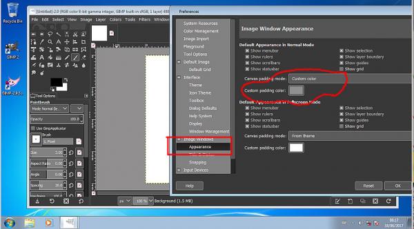
The area around the canvas is called the padding found in Image -> Appearance This can be changed from using the theme setting to a Custom color by clicking in the little color icon and selecting.

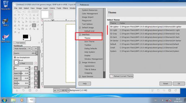
The Black theme too black? That can be changed in Interface -> Theme
Your own bespoke theme can be used but that is best left for another day.

In Gimp 2.9.5 unlike Gimp 2.8 changing the theme does not change the tool icons, making them difficult to see with a light theme.
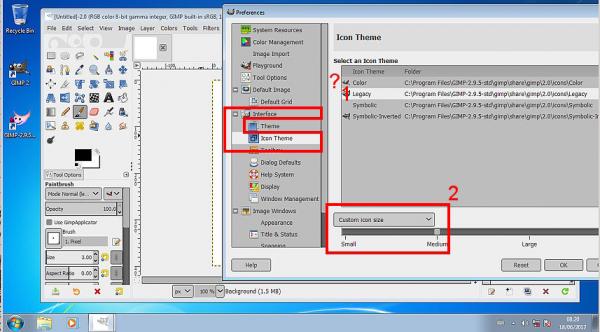
Use Interface -> Icon Theme In the Partha version the Color theme seems missing but the Legacy is there (1) Icons too small, use Custom icon size, and increase from small to medium. (2)

When all that is finished and you have Gimp set up the way you want, just a reminder you can fix this so Gimp starts up the same every time. In Windows Management untick Save Window positions on exit, click on Save Windows Positions Now Just a personal preference of mine

--------------
Next is just a comment on the Windows default Gimp Profile
Looking in Folders -> (any of the resources, say plug-ins)
The default Gimp profile is C:\Users\your-name\AppData\Roaming\GIMP\2.9 What sort of craziness is that?
![[Image: MLk9F2I.jpg]](http://i.imgur.com/MLk9F2I.jpg)
My advice is make new convenient folders for the resources you use, plug-ins / scripts / brushes ..etc
Add each, in the appropriate section, to the location list.
![[Image: bc0wgdm.jpg]](http://i.imgur.com/bc0wgdm.jpg)
Happy Gimping
edit: Looking at the Partha installation, There are no MyPaint Brushes installed
So this thread on how to install a new Gimp 2.9.5 resource folder.
https://www.gimp-forum.net/Thread-MyPain...39#pid2339
This is a nice version, quite stable and since it does not replace Gimp 2.8.x is worth using until Gimp 2.10 comes along.
However Nateart initial view of Gimp is this. A very black theme, a lot of contrast with the canvas.
What can you do about that? All the settings are in the Edit -> Preferences dialogues.
The area around the canvas is called the padding found in Image -> Appearance This can be changed from using the theme setting to a Custom color by clicking in the little color icon and selecting.
The Black theme too black? That can be changed in Interface -> Theme
Your own bespoke theme can be used but that is best left for another day.
In Gimp 2.9.5 unlike Gimp 2.8 changing the theme does not change the tool icons, making them difficult to see with a light theme.
Use Interface -> Icon Theme In the Partha version the Color theme seems missing but the Legacy is there (1) Icons too small, use Custom icon size, and increase from small to medium. (2)
When all that is finished and you have Gimp set up the way you want, just a reminder you can fix this so Gimp starts up the same every time. In Windows Management untick Save Window positions on exit, click on Save Windows Positions Now Just a personal preference of mine
--------------
Next is just a comment on the Windows default Gimp Profile
Looking in Folders -> (any of the resources, say plug-ins)
The default Gimp profile is C:\Users\your-name\AppData\Roaming\GIMP\2.9 What sort of craziness is that?
![[Image: MLk9F2I.jpg]](http://i.imgur.com/MLk9F2I.jpg)
My advice is make new convenient folders for the resources you use, plug-ins / scripts / brushes ..etc
Add each, in the appropriate section, to the location list.
![[Image: bc0wgdm.jpg]](http://i.imgur.com/bc0wgdm.jpg)
Happy Gimping

edit: Looking at the Partha installation, There are no MyPaint Brushes installed
So this thread on how to install a new Gimp 2.9.5 resource folder.
https://www.gimp-forum.net/Thread-MyPain...39#pid2339


![[Image: 15871545_10154849867538431_4425975227108...e=5B12DEC4]](https://scontent-mia3-1.xx.fbcdn.net/v/t1.0-9/15871545_10154849867538431_442597522710825874_n.jpg?oh=b9dd1856befb9a3c1afda17296efac7a&oe=5B12DEC4)
![[Image: LaOnlsY.jpg]](http://i.imgur.com/LaOnlsY.jpg)
![[Image: eToO8Cs.jpg]](http://i.imgur.com/eToO8Cs.jpg)