I don't think I would even notice colours becoming a bit more dull...
We printed a book, 27 copies, mostly just for our relatives/friends cycle. The cover turned out to be awful. It's so dark, it's hard to distinguish any details or colours. I don't think it even contains those neon and bright colours everybody is warning about.
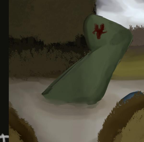
Here is the most part of the artwork of the cover, how it looked originally, in the monitor, and how it approximately looked when printed:

Technically, I got the second image by passing in the first image to rgb2cmyk.org, saving it as TIFF and then opening in my regular image viewer. (If opened in GIMP, it is displayed lighter.) And then putting the first and second images together and making a screenshot of both.
But, anyway, this is approximately the feeling I get when I view the original artwork on screen and the actual book in real life side by side.
Small adjustments don't seem to make a big difference. If I raise the bottom left and lower the top right in the levels, until the out-of-gamut overlay disappears, I get a very washed out image. I don't even understand why darkness is a problem, when the actual book is so much darker than it should have been. Apparently, they can print dark image just fine...
This is the original part of the cover art:

Quote:Using Cyan plugin just creates a color-separated CMYK file.
I apparently don't understand this really.
Let's assume, there are 6 colours my screen can display – A,B,C,D,E,F, and there are only 3 colours the printer can print – a,c,e.
A is very similar to (is the same as) a, C to c, E to e.
B, D, F is out of gamut.
But B is the most similar to a, D to c, F to e.
So, if my image is a flag of three bands in colours A, C, and F (F being out of gamut),
when the printer tries to print it, it should print the colours a, c, and e – if it's smart enough.
That's why I expected that converting the RGB image to the CMYK image with the printer-specific profile would convert the image so that
colour A is stored as a, C as c and F as e (let's say that matching F to e depends on the algorithm being used, perceptual, relative colorimetric + black compensation or not etc.).
And now, when I import it back into GIMP, which converts it to RGB, the colours should be converted back to a => A, c => C, e => E.
Meaning, the colour F could now be colour E, which I would see as a bit changed image, but at least now the whole RGB image should be within the CMYK gamut.
At least, that's what I thought or hoped for. Are you saying that that's not what actually happens?


