Posts: 1
Threads: 1
Joined: May 2022
Reputation:
0
Gimp version:
Operating system(s): Windows Vista or 7, 8, 10 (64-bit)
Hi, I just need to get my font a little bit thicker/fuller but bold just gets it too dense. I got the font from another image but when I use it gets way too thin, but bold doesn't help me either. I'm using the font "Good Vibrations", the cursive version.
Posts: 1,543
Threads: 73
Joined: May 2021
Reputation:
168
Gimp version:
Operating system(s): Linux
05-20-2022, 05:58 AM
(This post was last modified: 05-20-2022, 06:08 AM by PixLab.)
(05-19-2022, 08:47 PM)Borracha22 Wrote: Hi, I just need to get my font a little bit thicker/fuller but bold just gets it too dense. I got the font from another image but when I use it gets way too thin, but bold doesn't help me either. I'm using the font "Good Vibrations", the cursive version.
So if I'm right it's this font ➤ https://www.fontpalace.com/font-download...ns-script/
Not an easy one as there are part of a letter which are thinner than other parts of the very same letter.
Agree the bold is way too thick.
After few tries, I came to something which looks not bad and "respect" the thickness proportion IMO
Write your text,
Then in the layer stack/dialog right click on it and select Alpha to Selection
Then menu Select ➤ Save to path
Then menu Select ➤ None
create a New Layer
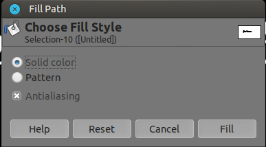
Then menu Edit ➤ Fill path...

Why this method instead of:
Write your text,
Then in the layer stack/dialog right click on it and select Alpha to Selection
Then menu Select ➤ Grow (1 pixel)
create a New Layer
Then bucket fill or drag n drop the FG/BG color to the selection
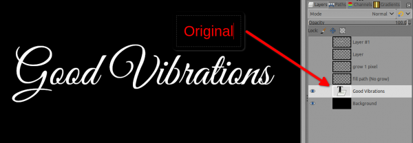
here is the difference:
Original

Fill path (no growing selection)

Fill selection with growing 1 pixel)

In the end it's your call of which either you like the most, but expect some deformations 
Posts: 6,955
Threads: 297
Joined: Oct 2016
Reputation:
605
Gimp version:
Operating system(s): Linux
(05-19-2022, 08:47 PM)Borracha22 Wrote: Hi, I just need to get my font a little bit thicker/fuller but bold just gets it too dense. I got the font from another image but when I use it gets way too thin, but bold doesn't help me either. I'm using the font "Good Vibrations", the cursive version.
A solution is to create an "outline" which is the same color as the initial text ( Layer > text to path, Edit > Stroke path in Line mode), this may require adding some space between characters when creating the initial text.
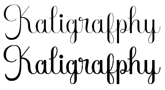
Below, top-down:
- the original font (URW Bookman Light),
- the "thickened" font (2px outline),
- a natively thicker font (URW Bookman Semi-bold).
Posts: 1,451
Threads: 220
Joined: Sep 2018
Reputation:
134
Gimp version:
Operating system(s): Windows 11
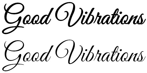
Another trick is to duplicate the text layer 1 or more times and shift the copied layers to left, right, up and down (or just one of these)
On the bottom the original, the one above is 4 times shifted (L, R U and D)

 Good Vibrations.xcf
 (Size: 112.92 KB / Downloads: 302)
Posts: 149
Threads: 2
Joined: Mar 2019
Reputation:
56
Gimp version:
Operating system(s): Linux
Another way :
Use Filters > Blur > Median blur... on your text layer with parameters:
- Percentile: 1.0
- Alpha Percentile: 100.0
- Radius : as you want
- Abyss policy: None
Note that when doing this, the text layer is transformed to a normal layer.
Posts: 6,955
Threads: 297
Joined: Oct 2016
Reputation:
605
Gimp version:
Operating system(s): Linux
Thought about another method while answering another post. Use Drop shadow with no blur and no offset, and just 1-2px of growth at full opacity:
With the perk that you can save these specific Drop Shadow settings and so reapply quickly if you need this often.
Posts: 1,063
Threads: 88
Joined: Aug 2018
Reputation:
83
Gimp version:
Operating system(s): Windows Vista or 7, 8, 10 (64-bit)
05-21-2022, 09:35 PM
(This post was last modified: 05-21-2022, 09:36 PM by Krikor.
Edit Reason: I forgot the image
)
Another brick in the wall...
Use: G'MIC - Contours - Morphological Filter on your text layer with parameters:
Action - Dilation.
Kernel - Octagonal (or choice yours).
Size - 2 ( or as you wish).
Process TRansparency - Ticked.
 fx_morphological 1,1,2,"1,0,1; 0,1,0; 1,0,1",0,1,0,0,0,50,50
"All in all it was all just bricks in the wall" - Rogers Waters
.....
Samj Portable - Gimp 2.10.28 - Win-10 /64.
|


