11-16-2017, 07:08 PM
There is a bit more here with some extra info/screenshots http://www.gimpusers.com/forums/gimp-use...ot-clearer
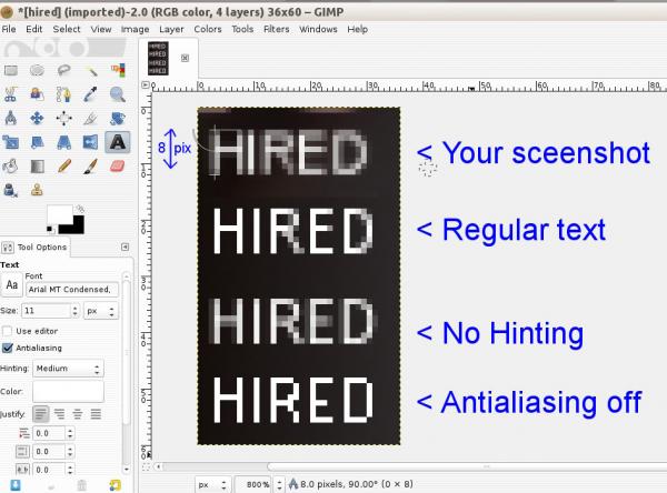
It is all very tiny. Your 'HIRED' text is actually only 8 pix high.
This shows some options, and the only one to give hard outline, is text with antialiasing turned off.

I do not think that is the problem. Most likely some conversion when applied to a page web. You are using png which is correct ... back to the question of text size.
It is all very tiny. Your 'HIRED' text is actually only 8 pix high.
This shows some options, and the only one to give hard outline, is text with antialiasing turned off.
I do not think that is the problem. Most likely some conversion when applied to a page web. You are using png which is correct ... back to the question of text size.


