
Thread Rating:
  • 0 Vote(s) - 0 Average
  • 1
  • 2
  • 3
  • 4
  • 5
Most accurate way to colorize a layer?
#1
I'm trying to tint the merged image of the couple in this screenshot to be shades of the main color of the background.
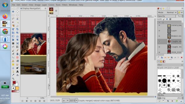
   

I have the hex code of the background red color (94151a), and with it, the RGB and HSV numbers. I've tried everything I could find under the Colors menu to plug these in to get the color I want, but with no success. The RGB numbers just make the faces look sick. I tried using Sample Points and Curves and tried matching the HSV there, but the result was the same.

The closest I get is when I use Colorize, but I'm just doing it by eye and the results are chancy at best. The cover, front and back, will have four or more images that need to match, and I'd like to do it scientifically if I can.

Am I missing a tool somewhere? Will using the HSV numbers do me better, and if so, where can I try?

I had to do the same thing with the cover of the first book in the series, and somehow managed it. But as I said, it was by sheer dumb luck.
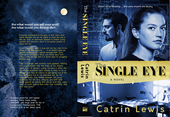
   

EDIT--- I also want to apply the same sort of "glow" to the background of the red cover that the blue one has, but that'll be a separate question.



Attached Files
.xcf   2026_0611 Screenshot.xcf (Size: 1.6 MB / Downloads: 46)
Reply
#2
I used 'Colours / Colorise' (choose a colour and play with the sliders from the colour dialog)  and then 'Filter / Artistic / Softglow' (play with the sliders)

   
Reply
#3
Just an alternative to the colorise filter - a little more hands on.

I took this from your Gimp screenshot which seems a bit lighter than the attached xcf - I do not know which is correct, so just an alternative.

(1) colour select from the background (2) the image desaturated (3) new layer filled with selected colour (4) Layer Mode set as HSL Colour.


But then I did a little bit of colour matching using the original image.
1 minute 20 seconds example: https://sendvid.com/nei3p6lh  Never going to be exact, white frames tend to get coloured.
Reply
#4
Desaturate the entire image then using the colour you wish you will get the same colour tones all over. And if the red seems too garish drop the opacity (35% normally) then change the layer mode.


Smile
Reply
#5
I hadn't thought of trying desaturation first. I'll have a go at it.
Reply
#6
If you use the rich workflow, you can first desaturate the drawing using 'Colors / Desaturate / Mono Mixer'. There you have more options to convert specific color gradations into other shades of gray.

   
Reply
#7
Thank you to everyone who replied. Here's what I've come up with so far:


I tried taking the desaturation route, but couldn't make it work. If I could readily recall what I did do, I'd be a better Gimper and more useful on this forum. Let me see . . . Yes, I went to Colorize and used the eyedropper to match the tone of the couple in general to the infill on the Fachwerk. This was too dark, of course, so I fiddled around with Brightness-Contrast to lighten things up. That wasn't instantaneous, but I made progress with it. 

I keep thinking I used another tool that had two eyedroppers to it, where you could choose one color on one part of the composition and choose another color to replace it with, but darned if I can find which one it was. Maybe someone here knows. I might need it again as I go on.

I'm pretty sure I used that and Colorize on the image of the violin, but I ended up using Sample Points to restore the highlight on the wood. Before that, it lacked contrast, and the red tone didn't go that well with the tone of the images above the yellow band.

The Softglow tool @denzjos suggested came in handy. I had what looked pretty good on my monitor, but when I ran a test print, it was all too dark. Softglow took care of that. What I've got on my monitor now (which is what you see in the image included) looks way too light, but when I print it out, it's fine.

It also looks really brown, on my laptop monitor at least. But again, it prints out a good, rich red. What can you do? Maybe I'll have to brighten it up for the ebook cover, and leave it as-is for the print version.

You may notice that I haven't merged the Fachwerk and the composite image of the couple. I still have things to do to the background.
Reply
#8
It is good to see you experimenting with GIMP to achieve the desired result; that is how you discover the software's capabilities. Another option worth trying is the G'Mic-Qt plugin:
'Filters / G'MIC-Qt / Colors / Color Presets'. Select a LUT pack and browse through the presets. Here, I’ve chosen 'Hollywood Movies (74)' with the 'Aladdin' LUT. You can then play around with the various sliders for Strength, Brightness, etc. The result in this example might not be exactly what you’re looking for, but it serves simply to demonstrate the workflow.

   
Reply
#9
(06-25-2026, 06:22 AM)denzjos Wrote: It is good to see you experimenting with GIMP to achieve the desired result; that is how you discover the software's capabilities. Another option worth trying is the G'Mic-Qt plugin:
'Filters / G'MIC-Qt / Colors / Color Presets'. Select a LUT pack and browse through the presets. Here, I’ve chosen 'Hollywood Movies (74)' with the 'Aladdin' LUT. You can then play around with the various sliders for Strength, Brightness, etc. The result in this example might not be exactly what you’re looking for, but it serves simply to demonstrate the workflow.

I haven't yet experimented with plug-ins . . . I tend to go for the tool I need at the moment. But as you say, it's good to discover the possibilities. There are wonders to be known!
Reply


Forum Jump: